How to Layer Neutrals Without Making a Space Feel Flat
Layering neutrals is less about picking “safe” colors and more about orchestrating subtle contrast, texture, and light. Done well, a neutral room feels rich, inviting, and dynamic—not bland. Here’s how to get there.
1. Start with a Clear Neutral Palette
Before you think about pillows and throws, define the overall neutral story of the room.
Choose a temperature:
- Warm neutrals: creams, beiges, taupes, greige with yellow/red undertones. Cozy and inviting.
- Cool neutrals: soft grays, stone, blue-grays. Calm and airy.
- Mixed neutrals: can work, but intentionally—don’t randomly combine cool gray with yellow-beige without a bridging color.
Limit your core colors:
- Pick 2–3 main neutrals:
- One dominant (walls or large rug/sofa)
- One secondary (large furniture, cabinetry, drapery)
- One accent neutral (smaller pieces, trim, accessories)
Keeping the palette tight lets you introduce variety through texture and value instead of competing colors.
2. Play With Value (Light, Medium, Dark)
Flat rooms usually suffer from everything being the same “strength” of color. Use lightness and darkness to create depth.
Aim for a neutral “value ladder”:
- Light tones: walls, ceilings, sheer curtains, some upholstery.
- Mid tones: major furniture, area rug, built-ins.
- Dark tones: side tables, frames, hardware, accent chairs, a throw or two.
Example:
- Walls: soft warm white
- Sofa: mid-tone greige
- Rug: light, with some darker threading or pattern
- Sideboard + coffee table: deeper wood or charcoal
- Lamps, frames, and small décor: black, deep bronze, or espresso
The contrast between light, medium, and dark gives the room visual structure without needing bright color.
3. Use Texture as “Color”
In a neutral space, texture does the heavy lifting that color often does in more saturated schemes.
Mix multiple textures intentionally:
- Soft & plush: bouclé, chenille, velvet, faux fur
- Crisp & smooth: linen, cotton, tight-weave upholstery
- Natural & tactile: jute, sisal, seagrass, raw wood, rattan
- Reflective & sleek: metal, glass, glazed ceramics
- Matte & chalky: limewash, plaster, matte paint, unglazed ceramics
Think in contrast pairs:
- Nubby sofa + smooth leather chair
- Chunky wool rug + sleek metal coffee table
- Rough wood console + glossy ceramic lamp
Even within a single color (for example, all off-whites), these textural differences will keep the space from feeling flat.
4. Layer Neutrals Across Materials, Not Just Fabrics
A room feels richer when neutrals repeat across different surfaces, not only textiles.
Consider layering neutrals in:
- Floors: light oak, dark walnut, stone, pale concrete
- Wood finishes: don’t match everything; combine one lighter wood with one darker, or wood + painted piece
- Metals: choose one main metal (black, brass, chrome, bronze) and one secondary in small doses
- Stone and tile: marble, travertine, limestone, terrazzo in quiet patterns
- Ceramics and glass: matte vases, clear or smoked glass, simple pottery
What matters is variety of finish within a controlled palette: matte vs gloss, rough vs smooth, warm vs cool.
5. Add Subtle Pattern (Even in Tiny Amounts)
Pattern introduces movement and dimension without breaking the neutral feel.
Good neutral-friendly patterns:
- Thin stripes (on linen, cushions, throws)
- Small-scale checks and herringbone
- Understated geometrics in tone-on-tone
- Organic patterns that mimic nature (marble veining, subtle botanicals, hand-knotted rug variations)
Keep pattern:
- Low contrast (cream on beige, gray on white)
- Varied in scale (one larger pattern, one small-scale, one near-solid)
Even a single patterned rug or set of striped pillows can be enough to stop a neutral room from feeling lifeless.
6. Use Contrast Thoughtfully, Not Sparingly
Many neutral interiors fail because they avoid contrast altogether. You don’t need bright color, but you do need moments of visual punctuation.
Easy ways to add contrast:
- Dark accents: black or espresso picture frames, lamp bases, side tables, cabinet hardware, or a dark-framed mirror.
- Edges and outlines: dark window frames, a dark coffee table against a light rug, or a dark throw folded over a pale sofa.
- Anchoring elements: a dark rug in a very light room, or a deep-toned armchair in a sea of beige.
The idea: a few deeper notes to “ground” all the light tones, like bass notes in music.
7. Work With Light (Natural and Artificial)
Neutrals are extremely responsive to light. The same beige can look warm and golden in daylight and flat under harsh bulbs.
Natural light:
- North-facing rooms: go warmer with your neutrals to prevent a cold, gray cast.
- South-facing rooms: can handle cooler grays and “cleaner” whites.
Artificial light:
- Choose bulbs around 2700K–3000K for warm but not orange light.
- Use layers of lighting:
- Ambient: ceiling lights
- Task: floor/desk lamps for reading, kitchen under-cabinet
- Accent: picture lights, wall sconces, small table lamps
Soft, layered light enhances texture and shading so your neutrals look nuanced, not dull.
8. Pay Attention to Undertones
Ignoring undertones is one of the quickest ways to make a neutral room feel “off” or muddy.
Common undertones in neutrals:
- Beige: can skew yellow, pink, or green
- Gray: often leans blue, green, or purple
- White: may be cool (bluish), warm (creamy), or neutral
How to keep it cohesive:
- Line up your paint chips, fabrics, and finishes together in natural light.
- Avoid mixing clashing undertones (e.g., pink beige sofa + green beige carpet + cool blue-gray walls).
- Either commit to a family (all warm, all cool) or introduce a bridging neutral like greige that can relate to both.
9. Layer in “Quiet Color” Without Breaking the Neutral Feel
You can keep the room neutral yet still use extremely soft color that reads almost like a shade of gray or beige.
Consider:
- Very muted sage, clay, blush, or stormy blue in tiny doses: a throw, a piece of art, a vase.
- Desaturated versions of color that barely register as colorful in low light.
These whispers of color add life and complexity while maintaining the calm, neutral vibe.
10. Curate, Don’t Clutter
Layering doesn’t mean crowding every surface.
To avoid a busy-but-blank look:
- Choose fewer, larger pieces over many tiny items.
- Group objects in odd numbers (3s and 5s) and vary heights.
- Leave empty space on shelves and tables so your textures and shapes can stand out.
A neutral room relies heavily on form, shadow, and texture. You need room for each piece to be noticed.
11. Use Art and Shape to Add Dimension
Since you’re not relying on bold color, let shape and composition add interest.
- Oversized neutral artwork (charcoal, pencil, black-and-white photography, sepia prints)
- Sculptural objects: curved lamps, stone or wooden bowls, chunky candles, unique vases
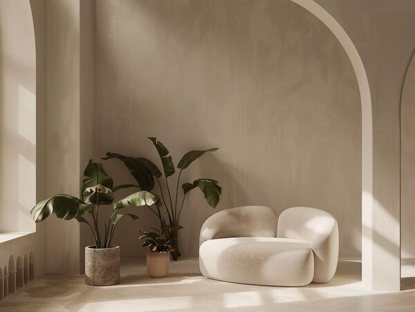
- Furniture silhouettes: mix clean-lined pieces with one or two softer, rounded forms (a curved sofa, a barrel chair, a round coffee table)
Even if the colors are muted, strong shapes add a three-dimensional feel.
12. Bring in Nature
Organic elements keep neutrals from feeling synthetic or sterile.
Simple touches:
- Wood with visible grain
- Branches or greenery in a vase (even if they’re deep green, they usually read as a “neutral” in interiors)
- Linen or cotton drapes instead of slick synthetics
- Stone side tables, travertine trays, or a marble coffee table
Nature gives inherent variety in tone and texture, which stops flatness without shouting for attention.
Putting It All Together: A Sample Neutral Layering Plan
Imagine a living room you want to keep fully neutral:
- Walls & ceiling: warm off-white
- Floors: light oak
- Large rug: pale wool with subtle tonal pattern
- Sofa: mid-tone greige linen
- Armchairs: soft taupe bouclé
- Coffee table: dark-stained wood or black metal with a stone top
- Side tables: one in natural oak, one in black metal
- Textiles:
- Cushions: mix of nubby cream, small-scale herringbone in light gray, and a thin black stripe on off-white
- Throws: chunky knit in oatmeal, lightweight linen in stone gray
- Lighting: brass floor lamp, black table lamps with linen shades, warm white bulbs
- Accents: black frames with black-and-white photography, off-white ceramic vases, a travertine tray
- Greenery: a large leafy plant in a textured pot
The color palette is almost entirely neutral, but the shifts in value, texture, shape, and finish make the room feel layered, not flat.
Layering neutrals successfully comes down to one idea: if you remove strong color, everything else has to work harder—light, texture, contrast, shape, and materials. When you balance those elements, a neutral space feels anything but boring.